The Elbow Plot serves as a grouping diagnostic, identifying the optimal number of model "families" by measuring their mathematical similarity. By finding the "sweet spot" where the curve bends, MMM Pilot distinguishes between truly different strategic options and mere variations, ensuring the AI presents you with a diverse shortlist of high-quality model candidates.
The Hypersampling Plot acts as a diagnostic tool to determine if your model is converging on a "sweet spot" or simply guessing. By visualizing thousands of trial runs, it reveals whether specific settings like Adstock or Saturation produce consistent, low-error results or if your data is too sparse to provide a clear signal for certain channels.
Understand the trade-offs between mathematical accuracy (NRMSE) and business logic (DECOMP.RSSD) using the Pareto Front. This guide explains how MMM Pilot filters thousands of models to find the "efficient" survivors, helping you avoid the trap of overfitting while selecting a plausible, actionable narrative for your marketing strategy.
Why does MMM Pilot generate multiple image files for a single analysis? Learn how to read the Model One-Pagers—the detailed "resumes" for the top-performing AI models. This guide breaks down the 8 essential diagnostic charts, from Waterfalls to Response Curves, helping you understand the "why" behind the algorithm's decisions.
Is your marketing model telling the truth? The Actual vs. Predicted Response chart is your primary tool for validating accuracy in MMM Pilot. Learn how to compare your historical data against the AI's predictions and interpret the R-Squared metric to ensure your budget decisions are based on reliable insights.
Don't just pick the model with the lowest error. The Pareto Clusters Detail plot is your map to finding the perfect balance between statistical accuracy and business reality. Learn how to navigate the trade-offs and select the right "Champion" model for your marketing mix analysis.
How do you know if your marketing model is confident in its results? The ROAS Convergence chart visualizes the stability of your model's learning process. Learn how to interpret these lines to ensure your ROI figures are based on a "settled" mathematical consensus rather than a lucky guess.
Stop guessing how to split your marketing budget. The Total Budget Optimization Result chart compares your historical allocation against the AI's "Bounded" recommendation. Learn how to read the difference between Average ROAS and Marginal ROAS (mROAS) to uncover "efficiency revenue" -extra growth you can unlock without spending a single extra dollar.
Where are you making money, and where are you burning it? The Media Efficiency Summary is your marketing ROI report card. Learn how to compare "Media Share" (what you spent) against "Media Contribution" (what you got) to identify which channels are punching above their weight and which ones are dragging down your profitability.
Are you overspending on ads that have stopped working? The Response Curves chart visualizes the "Law of Diminishing Returns" for every channel in your mix. Learn how to read these saturation curves to identify which channels are "maxed out" and which ones are scalable "rocket ships" ready for more budget.
Does your marketing work instantly, or does it take weeks to peak? The Weibull PDF Adstock chart visualizes the "memory" of your ads. Learn how to distinguish between "Direct Response" channels (immediate decay) and "Brand Building" channels (lagged peaks) to perfectly time your campaign bursts and measure ROI over the correct timeframe.
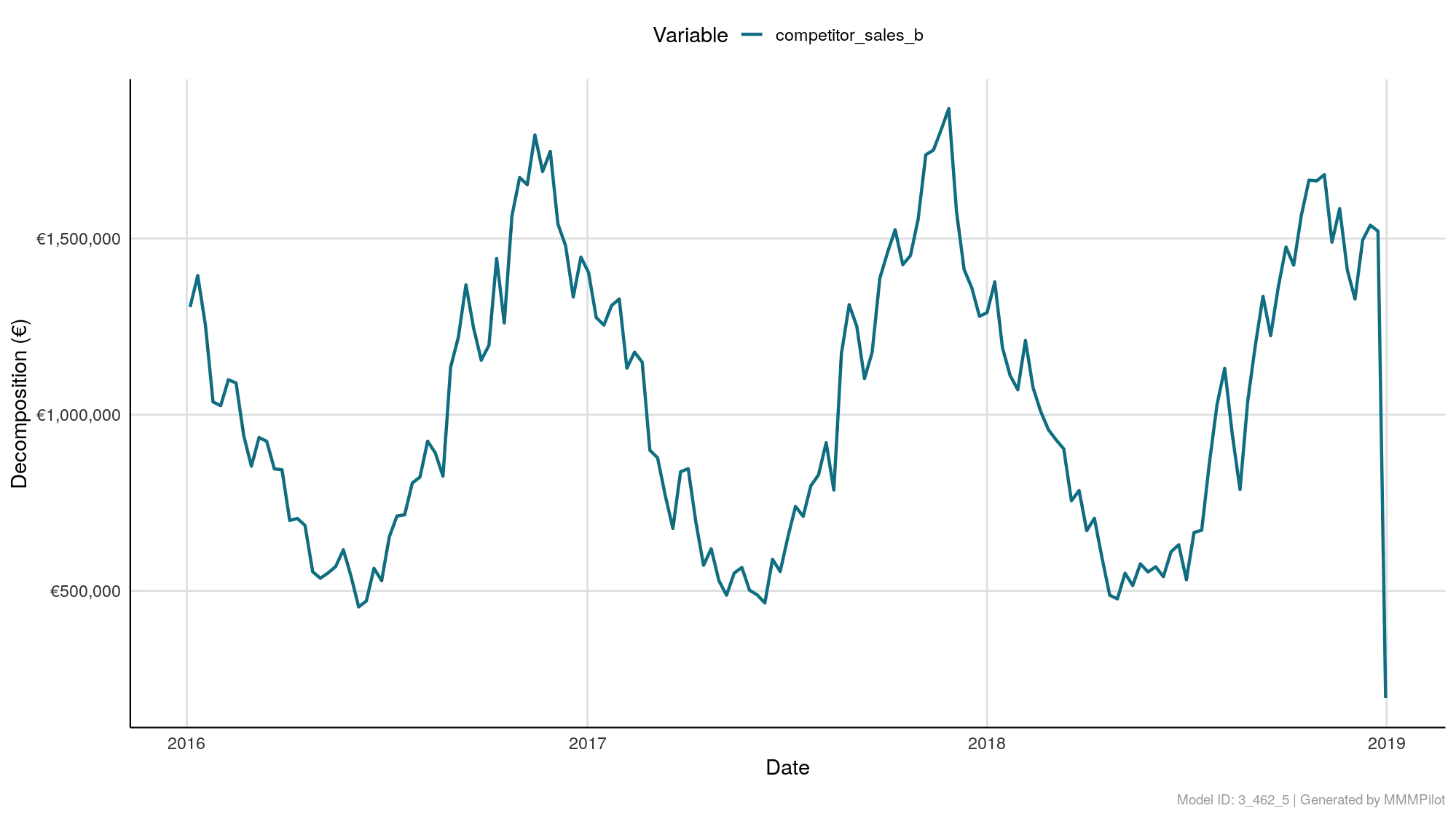
Marketing isn't just about paid ads. The Other Factors Decomposition chart isolates the revenue impact of your organic efforts (like newsletters) and external economic conditions. Learn how to prove the value of your "free" channels and understand how macroeconomic forces are helping or hurting your bottom line.
Did you sell more because of your ads, or because it was Black Friday? The Holiday Impact Decomposition chart isolates the specific revenue impact of calendar events. Learn how to distinguish between "earned" sales and "holiday" spikes, and identify which dates naturally suppress your revenue so you can save budget during dead zones.
Are your sales growing because of your ads, or just because it's December? The Trend & Seasonality Decomposition chart separates your marketing performance from natural business cycles. Learn how to distinguish between your long-term Brand Trend (the baseline) and recurring Seasonal patterns to avoid misattributing "lucky timing" to "marketing genius."
Why is the AI telling you to cut spend on your favorite channel? The Simulated Response Curve reveals the math behind the Budget Allocator's decisions. Learn how to read the saturation curves to visualize the shift from your "Initial" spend to the "Optimal" recommendation, ensuring you aren't wasting budget on channels that have already hit their limit.
It’s not just about how much you sold, but when. The Paid Channels Decomposition over Time chart visualizes the "heartbeat" of your media mix, separating the baseline from the marketing impact. Learn how to distinguish between "always-on" consistency and "flighted" campaign spikes to diagnose ad fatigue and timing effectiveness.
What really drove your total sales this year? The Total Response Decomposition chart acts as your marketing balance sheet, ranking every factor from Paid Media to Competitors by their total contribution. Learn how to distinguish between your "Baseline" revenue (brand equity) and "Incremental" revenue (marketing impact) to see the true picture of your growth drivers.